Beit Midrash is a desktop app designed to help Jews connect and study Torah together. Based on the age old Jewish tradition of chevruta study partnerships, Beit Midrash encourages users to search for partners and use tools within the app to engage in their Torah study in a completely customizable study space.
Research & Development
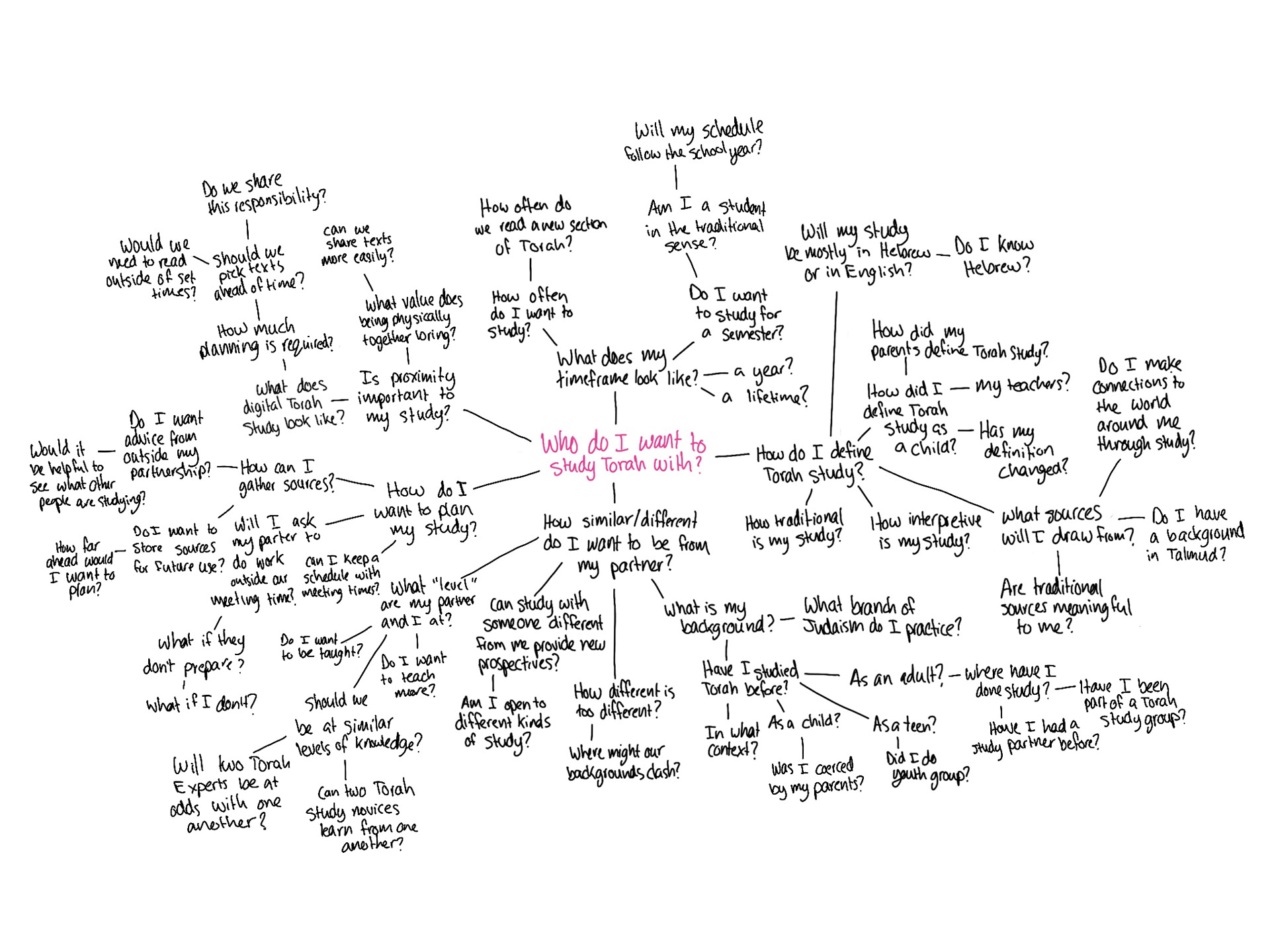
When examining tools that already exist in the world regarding chevruta Torah study, I noticed that they focus on entering Torah study as a beginner. Learning from one another, in the way I imagined, requires expertise. A shared language is required in order to teach and learn from each other. With this understanding, I identified my audience as people who engage with Torah in their daily lives (either as rabbis, cantors, lay leaders or teachers), but are searching for a deeper and more personal connection to Torah through a chevruta. While Beit Midrash is not only accessible to Jewish professionals, I anticipate a process of self selection as I designed it with this audience in mind. I turned to this audience to conduct research surrounding study partnerships, Torah study more generally, and the use of online applications in that study.
Visual Language
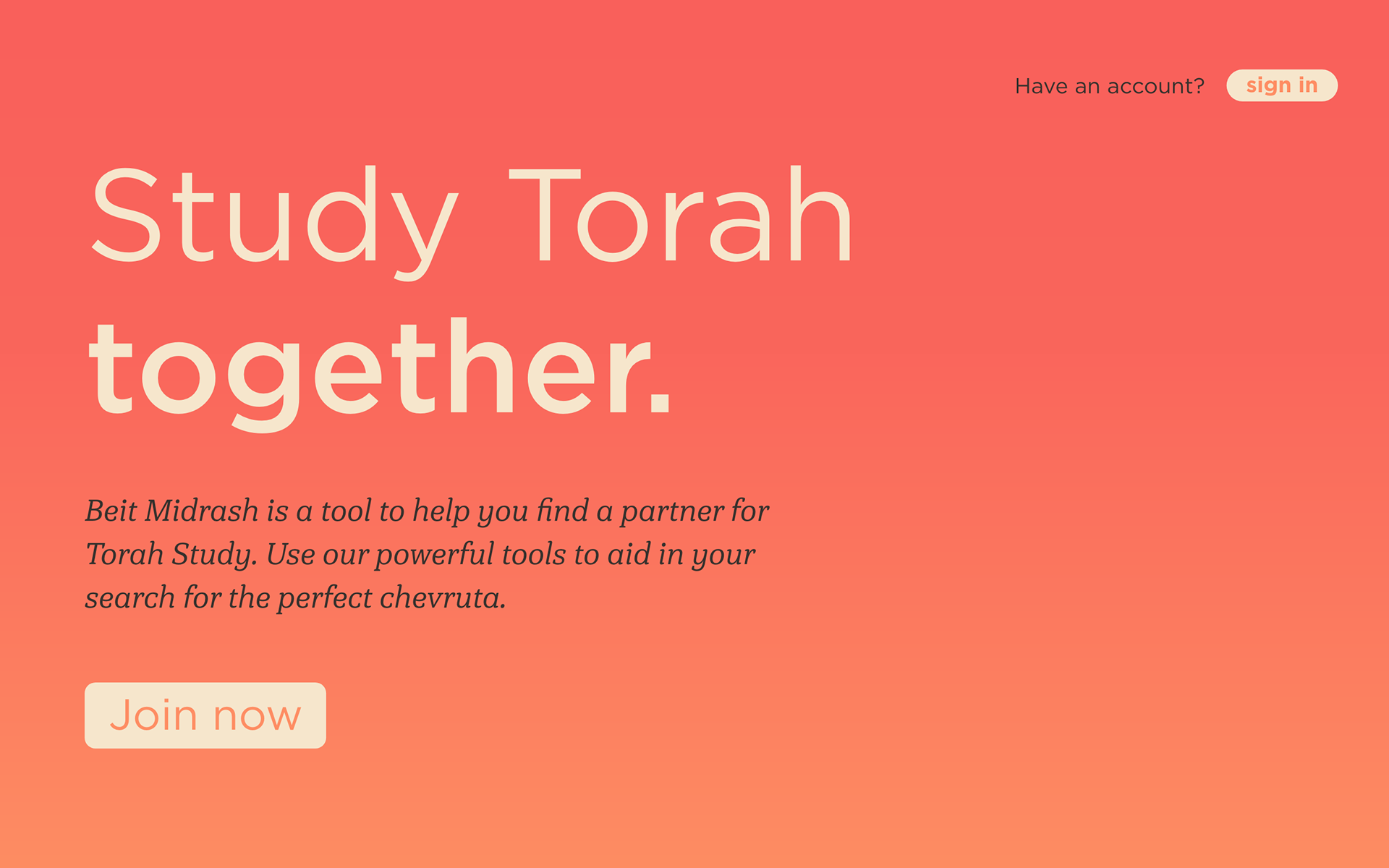
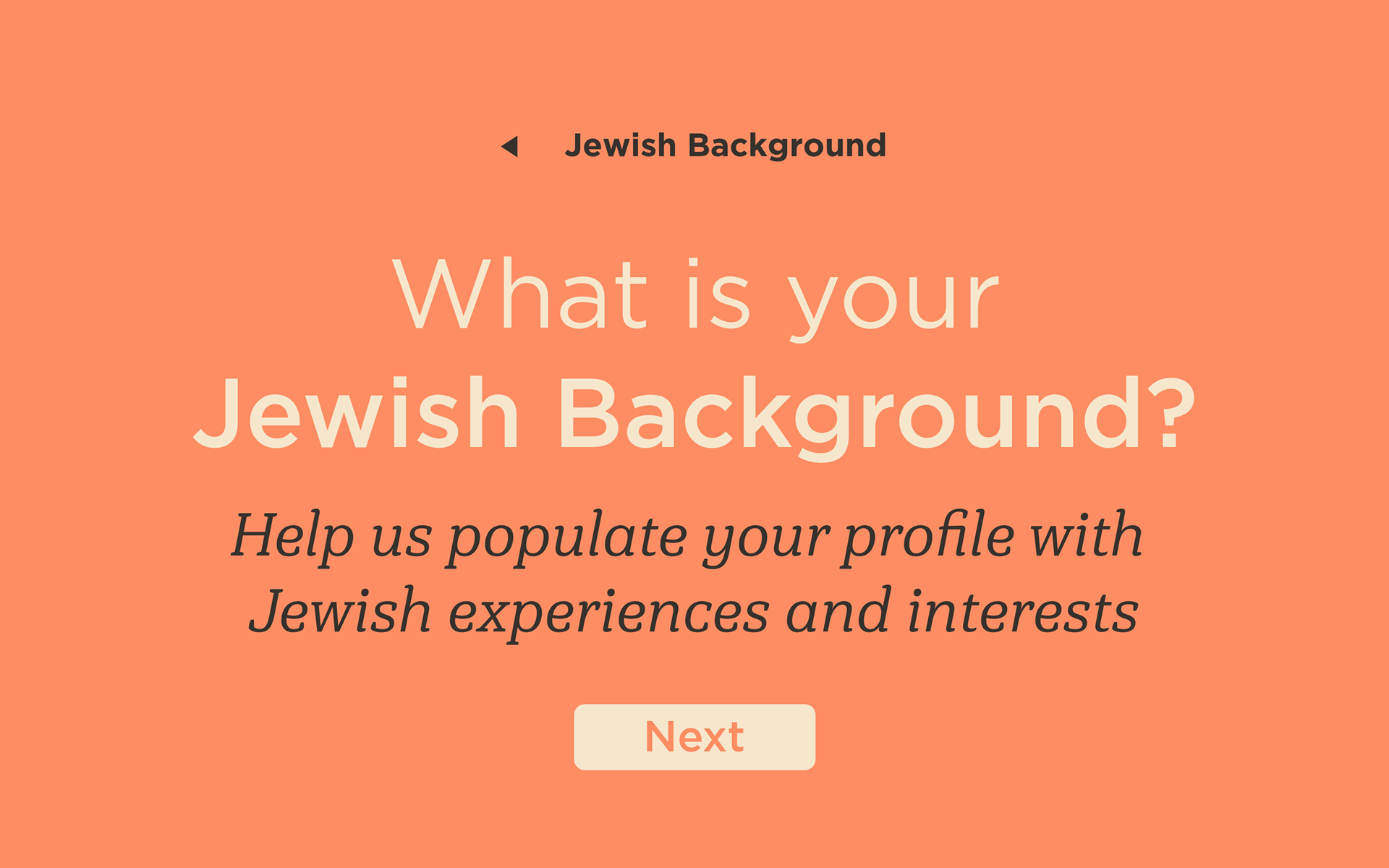
Beit Midrash uses a cohesive and simple visual language that communicates the intersection of sacred text and modern technology. The logo system utilizes both the Hebrew spelling and the romanization of the words Beit Midrash, which translates to House of Study. The logo uses the first letters of the words, Bet and Mem to create a symbol that will remind users of a house. An application with a lot of text requires a color palette with high contrast, but plain black and white felt too harsh for the content that would live in the app. Instead, I chose a warm grey and cream, which are easier on the eyes and simulate the worn pages of a book. The red and orange accent colors and gradient keep the design modern and exciting. Similarly, the typefaces Gotham and Hawking work to balance the antiquity of Torah with the modern sensibilities of a tool like Beit Midrash.
User Experience
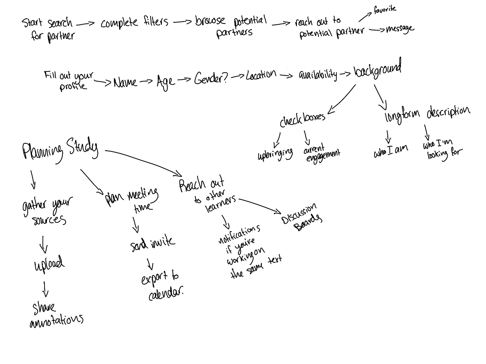
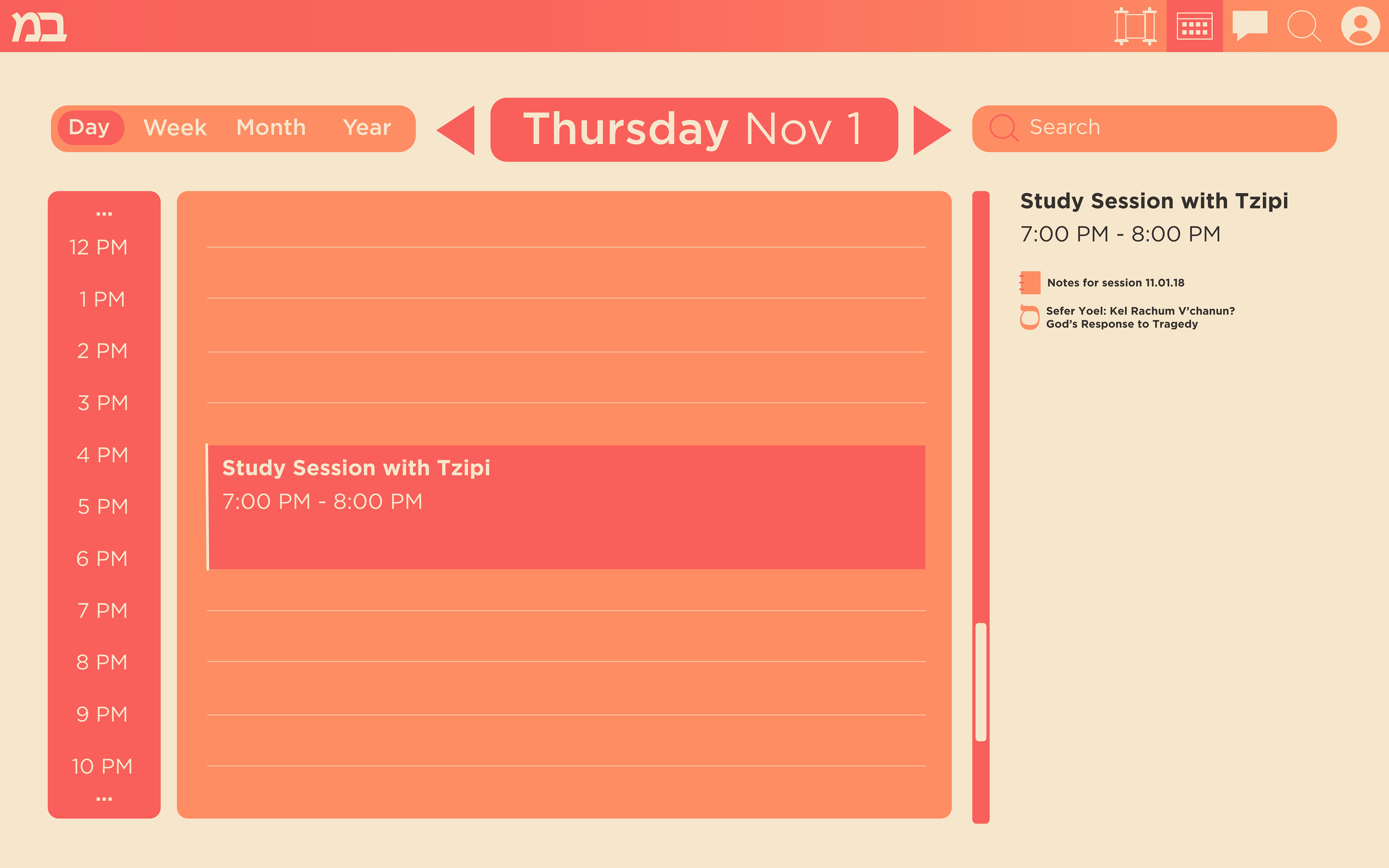
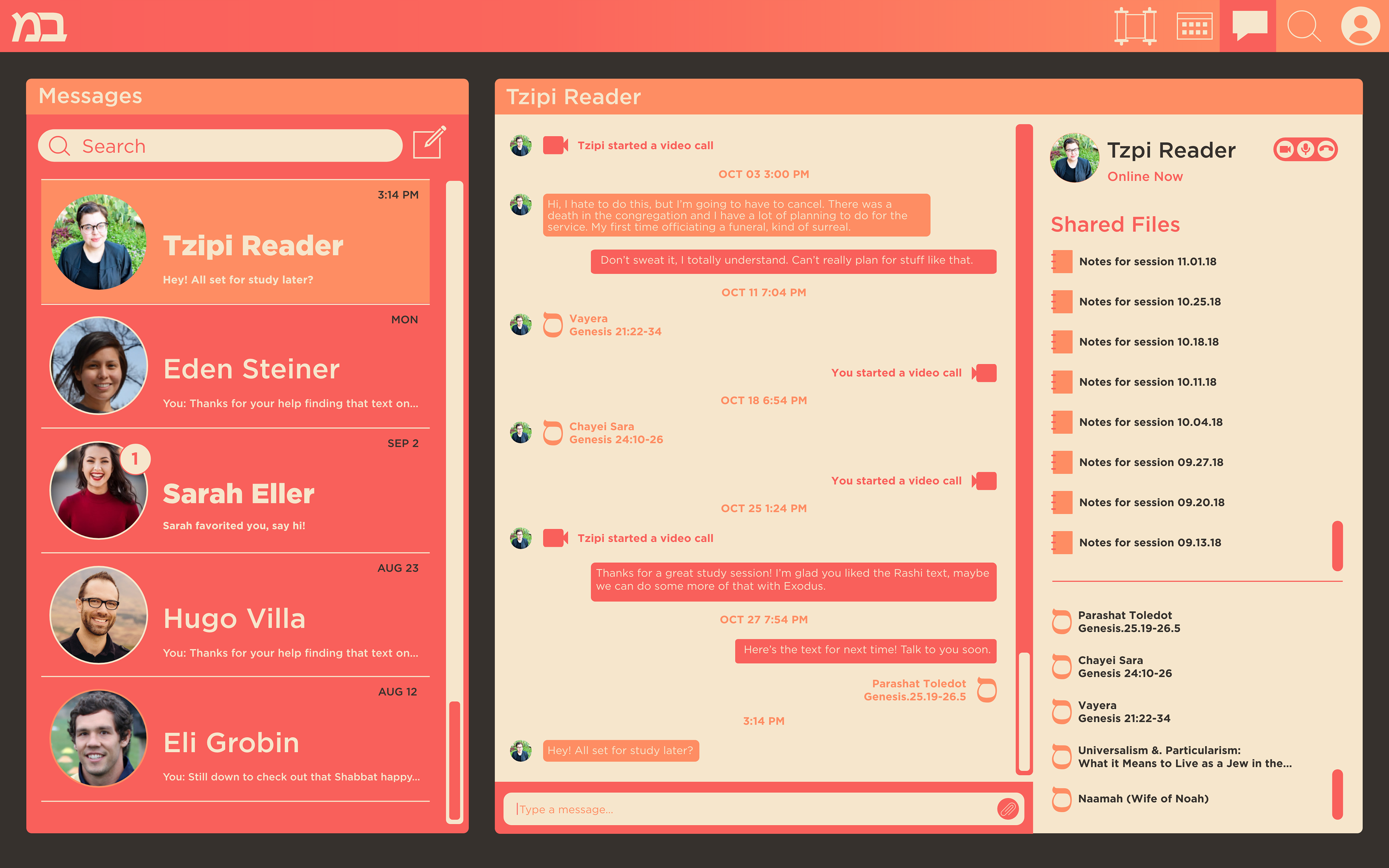
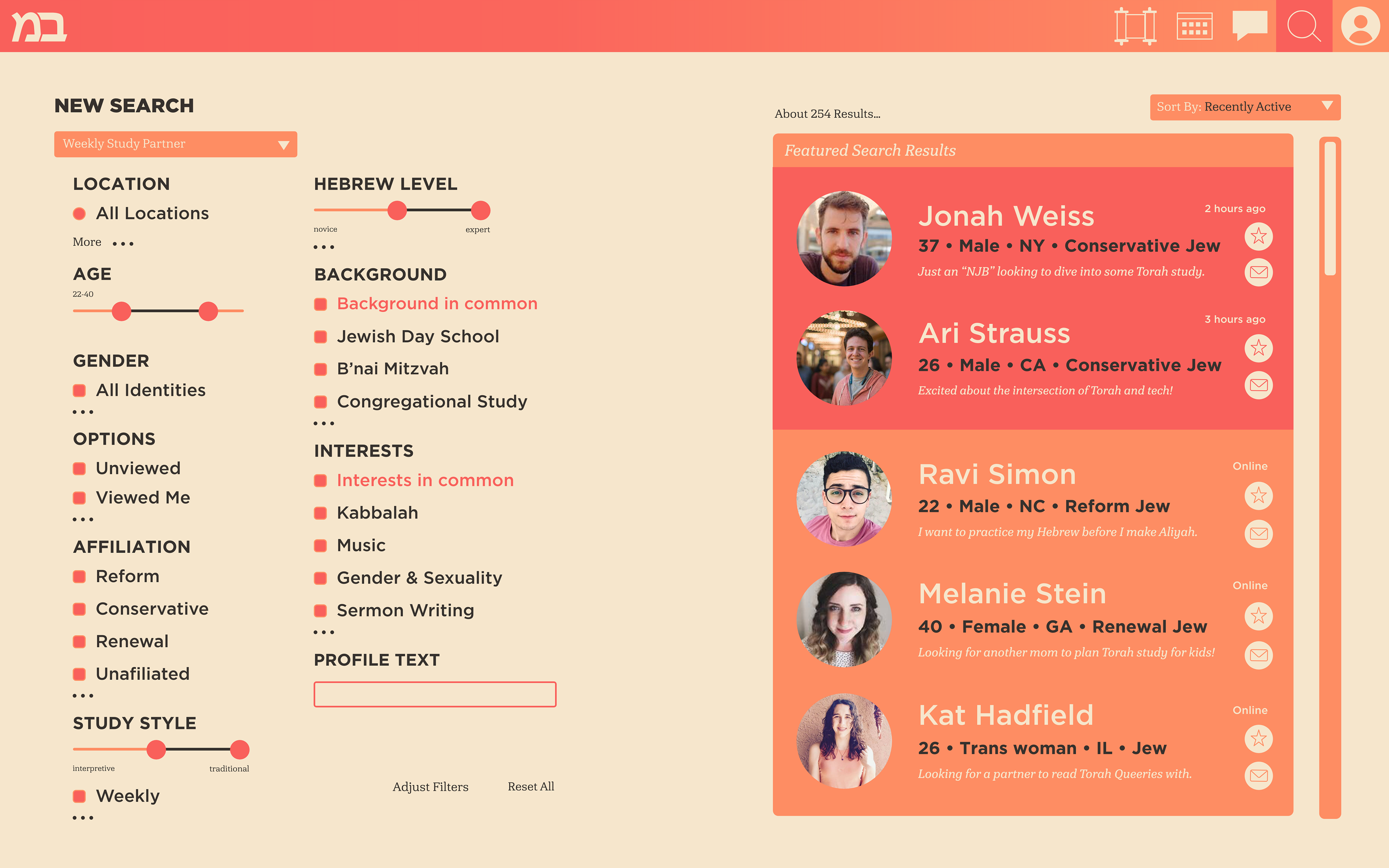
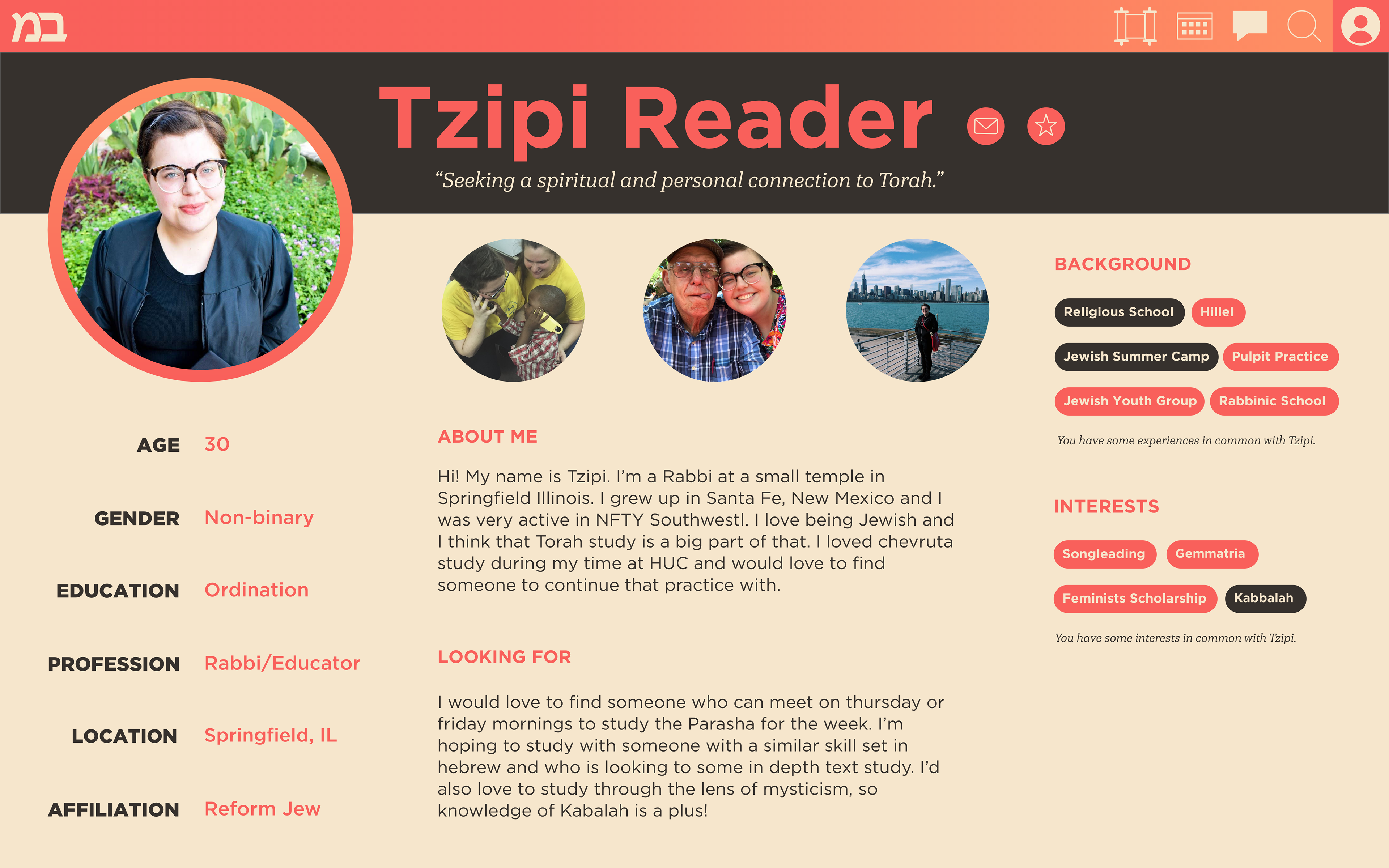
Beit Midrash uses the conventions of a dating app to help match partners to join in a chevruta for Torah study. Users fill out a profile, providing information about their identity, Jewish background, and interests. Users are then able to perform searches of other members, using a filter system, allowing them to search for partners that meet their needs. Users can save each others profiles and send messages in the local messaging system. Once users have connected, they can use scheduling and messaging tools in the app to plan their study sessions. The study tool is a completely modular space, allowing users to chose from preset workspaces or create and save their own. The study tool includes integration with Sefaria, a powerful open source collection of text and commentary, as well as the social annotation capabilities of the Google suite.

Deliverables
I planned and animated a walkthrough video of Beit Midrash using Adobe XD and After Effects. The process of connecting with a partner and planning and executing study is not something that can be achieved through a prototype, especially not by someone without a base knowledge of Torah Study. The walkthrough allows viewers to understand the functionality of the tool without the app being fully populated with potential partners. This video displays key features of Beit Midrash as we follow two users, Tzipi Reader and Ari Strauss as they connect and study Torah together.
